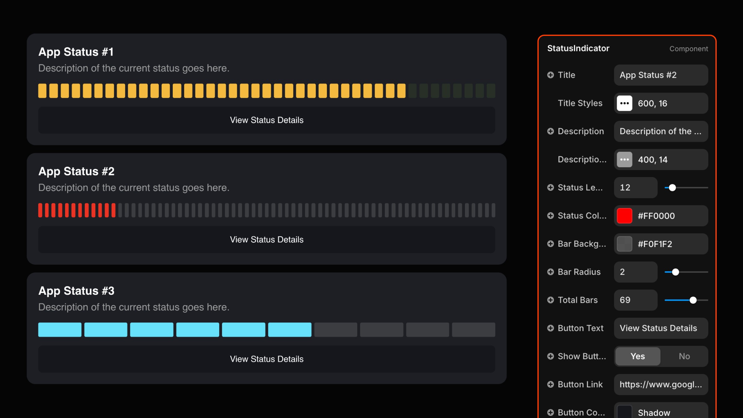
Framer Component
Status Indicator
How to Use the Status Indicator Component
Step 1: Copy the Component
Go to the Status Indicator section on our site, click Copy Component, and paste it into your Framer project.
Step 2: Add to Canvas
Drag the Status Indicator component onto your canvas and position it where you'd like it displayed.
Step 3: Configure Status Details
In the properties panel:
Title: Enter the heading text for your status.
Description: Provide a brief status summary.
Step 4: Customize Status Bars
Status Level: Adjust the active bars using the slider.
Total Bars: Set the number of bars (up to 100).
Status Color: Define the active bar color.
Bar Radius: Customize bar corner rounding.
Background Color: Choose the indicator background color.
Step 5: Adjust Button Settings
Edit Button Text, Button Color, and Hover Color.
Visibility: Toggle the button on/off.
Link Field: Add a destination link for the button.
Step 6: Style Typography
Title and description font styles, sizes, and colors are fully customizable.
Step 7: Add Hover Animation
Select hover transitions (instant, ease, or spring) with configurable timing.
Step 8: Preview and Finalize
Preview the design to verify the layout and animation. Fine-tune settings as needed.
Use Cases
This component is perfect for creating status pages to communicate website or app performance.
Hey, I'm James, Founder of Embark Studio and Digital Product Designer.
With over 15 years of experience, I've helped businesses transform their digital presence through stunning websites and smart, scalable design solutions.

